A corporate brand
built to carry its weight.
Creating a coherent corporate identity that allows Waldo Arch to show up with the confidence of the projects, relationships and contracts it already operates at.
Make the brand feel as substantial as the work behind it.
A focused corporate brand system designed to bring clarity, authority and consistency across the company’s public-facing touchpoints.
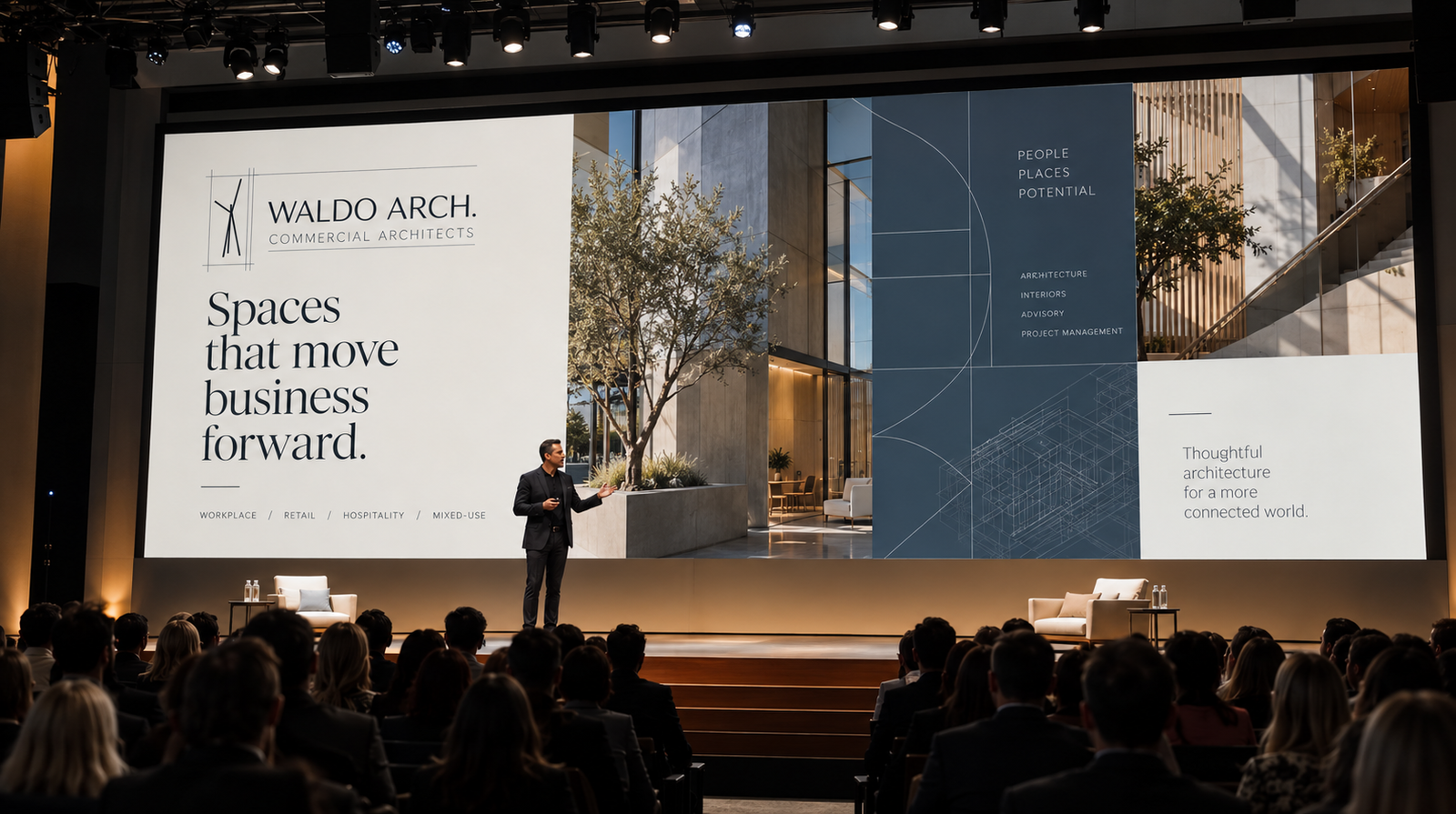
The work had scale. The brand needed to communicate that scale with the same level of confidence.
Waldo Arch needed a corporate presence that felt coherent, considered and credible across the places the company shows up. The focus was not on adding complexity. It was on creating a system strong enough to make the company look as established as the work it wins.
A corporate identity built around restraint, precision and a recognisable architectural language.
The system brings the mark, typography, colour and graphic structure into one coherent visual language — strong enough for corporate communication without becoming decorative for its own sake.


The identity becomes credible when it behaves consistently in the small, everyday moments.
Business cards, contact details, stationery and client-facing materials carry the same visual logic as the core identity — giving the company a consistent presence before the larger project work begins.


The brand needed a system that could live inside proposals, presentations and the conversations that win the next project.
The work extends beyond a logo. It creates a repeatable visual language for how Waldo Arch presents itself, communicates its capabilities and builds confidence around the work it is trusted to deliver.
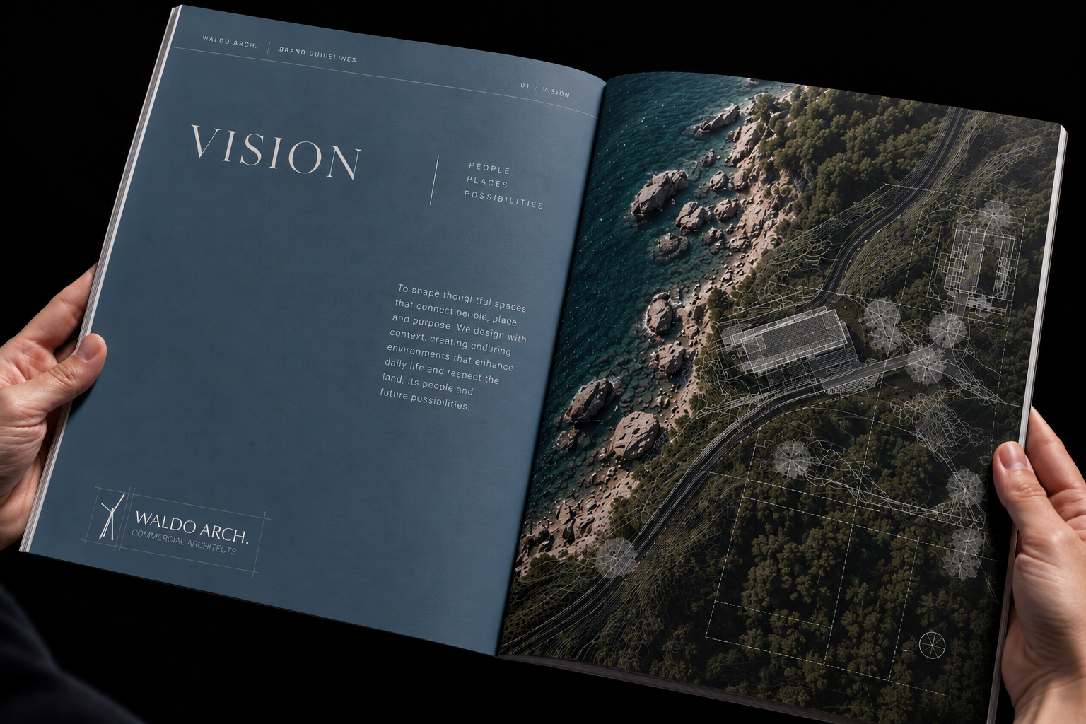
Waldo Arch gets a corporate identity that can stand beside the size of the work it already delivers.
The result is a more coherent and confident presence across corporate communication, presentation and client-facing materials — a brand built to carry the weight of the opportunities in front of it.